-
Type:
Feature Request
-
Status: Open (View Workflow)
-
Priority:
 Major
Major
-
Resolution: Unresolved
-
Affects Version/s: 2.2 Larks
-
Fix Version/s: backlog
-
Labels:
-
Environment:
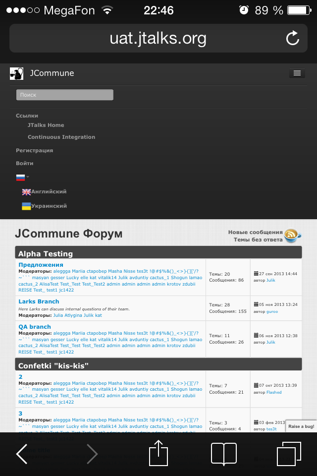
JCommune 2.2.1733, iPhone 4, iOS 7, Safari
Test Scenario
Steps:
1. Open forum and look on upper menu
2. Click on menu button
AR:
After step1 - there is only menu button, which is difficalt to click, so user needs to zoom
After step 2 - menu is open
My comments:
1) User zoom in step 1 to click menu button. After that, when menu is open, user should unzoom menu to see items. It is not ok.
2) Also, it is difficult to choose login item or sign up item in menu, and when user comes to forum firstly, he don't see whare login button is.
3) Besides, user can't understand is he logged in or not, because there is no information about it on main page - you should go to menu and check.
ER:
To my opinion,
1 - menu button shoud be bigger in size or maybe clickable area should be bigger
2 - text in menu should be on the whole page's width and bigger, maybe on the whole page if it is possible; as an idea - to show menu over the forum