Uploaded image for project: 'JCommune'
  1. JCommune
  2. JC-2023

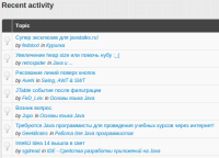
UI: Change the view of the topic list

VotersWatchers
    XMLWordPrintable

    Details

    • Type: Improvement
    • Status: Closed (View Workflow)
    • Priority: Major
    • Resolution: Fixed
    • Affects Version/s: 2.12 Larks
    • Fix Version/s: 2.13 Larks
    • Labels:
    • Sprint:
      2.13 Larks

      Description

      Some problems: (according to discussion):
      1. It's difficult to distinguish a topic title from created-by block (topic-starter and branch names).
      2. On the large screens so much empty space between columns.

      Some ideas for a solution from users:

      1. Increase space between topics.
      2. Decrease font size for topic-starter name and branch name.
      3. Topic-starter name and branch name don't mark as link. Make link near text as a icon.
      4. For large screens make special markup (Responsive design).
      5. Leave branch name and author name links but make those links black as usual text
      6. Use different colors for topic title and created-by block. Don't use italic font.

        Attachments

          Issue Links

            Structure

              Activity

                People

                • Assignee:
                  alex_popov Alexander Popov
                  Reporter:
                  terracott Denis Kajgorodov
                • Votes:
                  0 Vote for this issue
                  Watchers:
                  4 Start watching this issue

                  Dates

                  • Created:
                    Updated:
                    Resolved:

                    Structure Helper Panel