-
Type:
Bug
-
Status: Closed (View Workflow)
-
Priority:
Trivial
-
Resolution: Won't Fix
-
Affects Version/s: 3.0 Larks
-
Fix Version/s: 3.1 Larks
-
Labels:
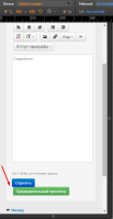
The buttons "Спросить" and "Предварительный просмотр" not exactly under each other when resolution is 320x568 when Q&A topic is created.
Steps to reproduce:
- Registered user logs in
- The user has permission for creating questions
- The Russian language is chosen
- User goes to the some branch and clicks on create question button
- The resolution 320x568 is chosen
AR: Buttons "Спросить" and "Предварительный просмотр" not exactly under each other by the left side.
ER: Buttons "Спросить" and "Предварительный просмотр" are exactly under each other by the left side.
![]() NOTE: This issue exists when resolutions are 360x640 and 360x592.
NOTE: This issue exists when resolutions are 360x640 and 360x592.
- relates to
-
 QA-2131
Check page with 360x640 px resolution, all elements on the page should be viewed, there are no horizontal scrollbars
-
- Open
-
-
 QA-2132
Check page with 320x568 px resolution, all elements on the page should be viewed, there are no horizontal scrollbars
-
- Open
-
-
 QA-2133
Check page with 360x592 px resolution, all elements on the page should be viewed, there are no horizontal scrollbars
-
- Open
-
