-
Type:
Bug
-
Status: Closed (View Workflow)
-
Priority:
Major
-
Resolution: Fixed
-
Affects Version/s: 0.14 swallows
-
Fix Version/s: 0.15 swallows
-
Labels:
-
Environment:
Windows XP, Chrome
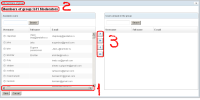
A bunch of corrections should be applied to the Edit Group Members dialog. You can find it if you open Poulpe and go to User Groups->EditMembers:
- There shouldn't be a horizontal scroll bar in the grids
- The title that mentions group name should go to the window title
- Move buttons should be sized to the icons size, they shouldn't be bigger than icons they have.

