-
Type:
Improvement
-
Status: Open (View Workflow)
-
Priority:
Major
-
Resolution: Unresolved
-
Affects Version/s: 0.18 Swallows
-
Fix Version/s: backlog
-
Labels:None
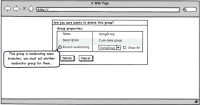
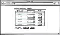
Right now if we're removing a user group and it appears to moderate some branch (is set as moderatingGroup within some branch), then after delete confirmation by pressing new dialog part raising, making this dialog big and ugly.
The dialog should be split into two. Details you can see at attached pictures.


